Friday, November 26, 2010

My Final Word

This was my first experience blogging and I spent extra time proofreading every post because my credibility was on the line—people will be reading my blog and I strived to ensure my posts were grammatically correct and without spelling mistakes. My biggest challenge was inserting the images within the text. The editing features for the images are very limited and, many times, the images mysteriously moved around within the editor— I found this part frustrating and it inhibited my creativity.
While analyzing the images for the blog, I learned visual rhetoric is something that everyone is exposed everywhere they are, and it can be processed and understood in many different ways. There is deeper meaning to everything you read or see and it’s important to take the time to analyze each piece of information one at a time to create an effective analysis. Every day I walk through the UCC atrium and stop to observe students who are actively participating in promoting a cause or providing information on a controversial issue. I found this communication is important in gaining new perspectives about the visual rhetoric presented by the students and each time I came away from these valuable experiences with a new awareness of other students’ life experiences. Overall, it helped me to become a better writer by teaching me to look at everything closer and use that information to make my writing more interesting. 
I eagerly looked forward to my Wednesday night classes because the topics always prompted interesting discussions from students who had amazing perspectives. The visuals presented by Dr. Green-Barteet provoked alot of thought and, from this wonderful experience, I was surprised at first when she presented this image and then intrigued with the painting titled "Benefits Supervisor Sleeping" by Lucian Freud (see Figure 1), which sold for 33 million U.S.
Figure 1. Benefits Supervisor Sleeping.
Source: London Evening Standard, April 11, 2008.
After searching the internet, I learned the painting is large and life size (59 5/8 x 86¼ inches), and the model is Sue Tilley, a job centre manager, who modeled for Freud several times. Freud did not use photographs; he insisted the model be present at all times until he finished painting the canvas. By enlarging sections of the painting on the internet for a closer look, I saw Freud spent a long time painting the details on every inch of the canvas. Although the painting may not appeal visually to some people, I appreciate the time and effort to create it and now have concluded that this painting, in my mind, is art and not to be dismissed as a fat naked lady sleeping on an old couch.

Being part of a blogosphere was a little intimidating at first because a blog was not only published to the class community but to the greater community of anonymous bloggers who can freely comment on my posts. Althought it gave me an opportunity to freely publish my thoughts and develop my writing style, I wonder who read it. I was expecting a more social aspect to blogging and maybe it would if a blog were to discuss a controversial issue that would generate an emotional response from the community. I wasn't sure how a blogger would encourgage others in the community to participate. Blogging about visual rhetoric is interesting but it may need an image to give a blog more punch and it lends itself to a journalistic style of writing.

What I've Learned and Taking Away from the Course:  
As a technical and professional writer,this course pushed me beyond my comfort zone in my writing. I can easily articulate a business problem and develop a proposal supported by numbers but it was challenging to develop a thesis statement and support an argument for an image with words. Writing about the rhetorical situation of an image was very unlike the policies and procedures I written in the past—it commanded a different style of writing. I learned, surprisingly, I could do it but it’s not easy and it’s hard work! I explored different ways to express myself and it took many revisions (and late nights) before I had a final version ready for submission. The peer reviews were helpful and many thanks to the students who took the time to review my work. Although I can make an argument about something, it must be supported to make a strong case—I can’t leave it hanging where people are asking “so what?”
And to Dr. Green-Barteet—thank you for expanding my knowledge and thinking with a variety of visuals and unique topics each lecture. As I walk through art galleries and museums with my artistic daughter, I can intelligently challenge her with an argument about art! I learned how to compose and support an argument, which are skills that I will use to write about issues that matter to me.

Other things I learned and experienced this term:
·         MLA does not allow bulleted lists
·         Turnitin.com—guilty until proven innocent!
·         Art can be defined as anything in the eye of the beholder
·         Fashion can be art, too!
·         Always question what I see in a photograph
·         A classroom shouldn’t be located across from the Grad Club  
·         MC Rm. 6 is one of the worst classrooms on campus

Friday, November 19, 2010

Remember This Every Year!

When I saw the London Free Press on November 9, 2010, the vivid blue in the photograph held my gaze (see Figure 1 below). As I unfolded the newspaper, I was impressed to see this enlarged photograph on the front page, and as I read the caption underneath, it made me smile because finally young people are realizing the true meaning of Remembrance Day.   

Figure 1. Thirteen-year-old Matthews Hall pupils  Jessie Tucker and Graham Peck are illuminated by  the names of those who died in the First World  War during a vigil at the London elementary  school on Monday. The naming of all 68,000 Canadians who perished in the 1914-18 war will  end 12 hours before the nation pauses for a momentof silence Thursday. (MIKE HENSEN, The London Free Press.

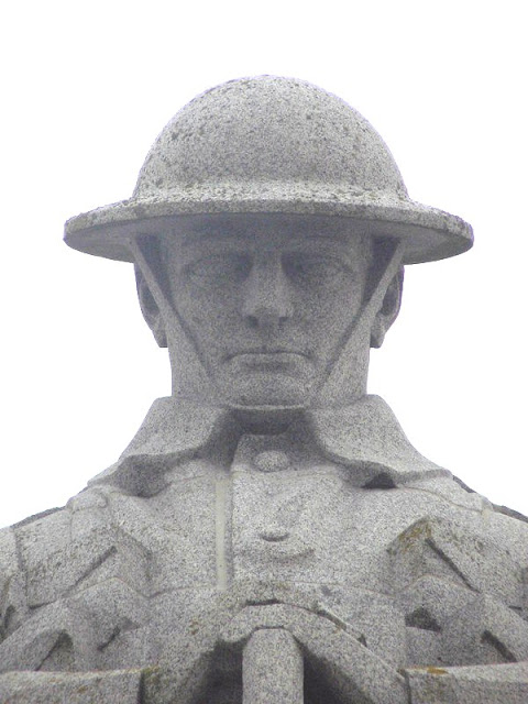
Schools across Canada participated in the remembrance project, The National Schools Vigil, where names of 68,000 soldiers who died in World War 1 were projected over seven consecutive days from November 4 to November 10.  In the photograph, two young people, a girl and a boy dressed in school uniforms, are standing at attention and staring ahead while the soldier between them stands with his head bent. The young people represent the men and women who volunteered to sacrifice their lives and respectfully watch as each name is displayed for 25 seconds. The soldier between the young people is known as “The Brooding Soldier” (see Figure 2 below) and he is a Canadian memorial located in St. Julien, Belgium where he stands as a sentinel, with an expression of sympathy on his face, over the battlefield were 2,000 Canadians died from the first German chlorine gas attacks.  

Figure 2. The Brooding Soldier, St. Julien, Belgium. Source: The WW1 Forum for the Netherlands and Flanders
 
The image of “The Brooding Soldier” is appropriate for the rhetorical situation because he now is given the duty of watching the names of 68,000 soldiers—an honorable representation! The statue is permanent and unchanging just like the war and its causalities. The gray color evokes a feeling of mourning and a sense of formality, which occurs at a funeral and is fitting for this situation. The blue background evokes calm and peace, feelings embraced by Canadians every day because of the illuminated names that appear on the wall. The caption helps the reader to understand the photograph because without it, the reader is left to guess the intended meaning. The accompanying article added to the rhetorical situation by providing detail information about the photograph and it helped the reader to put it into context. 
  
Remembrance Day is a day Canadians need to remember those who died, those who died in all wars, including those who were killed in Afghanistan. Remembrance Day is getting increased attention each year because of Canada’s ongoing participation in Afghanistan. We are able to immediately see and hear the details of each solider who died in Afghanistan—the vivid  images of a casket being unloaded from the cargo plane at Trenton and the detail expression of grief on the face of each family member. Every Remembrance Day, Carolyn Wilson will honor her son, Mark Wilson, who died October 2006 in Afghanistan, at the Victoria Park cenotaph in London, Ontario and is determined to make sure Canadians do not forget about those who bravely fought for Canada. She has my support! 
 

Sunday, November 14, 2010

Understanding the Misunderstood – Margaret Trudeau

 
Figure 1. Andy Warhol & Margaret
Trudeau; Studio 54, 1978. Photo by Adam
Scull - PHOTOLink.net
 A great admiration for Margaret Sinclair Trudeau Kemp developed the day I heard on the CBC evening news she married an old man, Pierre Trudeau, who was nearly thirty years her senior and Canada’s charismatic and flamboyant Prime Minister. Over the next few years, Canadians continued to hear about Maggie, the flower child, about her unusual antics and peculiar behaviour.  In the 1970’s, she became the misbehaving ex-wife who partied at Studio 54 with Andy Warhol (see Figure 1) to escape reality.


Figure 2. Margaret Trudeau; Studio 54,
1979. Source: cbc.ca
 

In Figure 2, Maggie looks delusional and, perhaps, experiencing uncontrollable euphoria. There was something wrong—something deeply wrong that people didn’t understand.


Figure 3. Margaret Trudeau,
September 2010.
Source: speakers.ca
After being diagnosed with bipolar disorder in 2001, Figure 3 shows a new Maggie. Looking outward, she portrays a strong and determined person who looks balanced and happy. Her facial expression gives the impression of hopefulness but there is weariness about her physical facial features that show her continuous fight with her mental illness. The wistful hair and her hand resting on the side of her face give the feeling of compassion and warm-heartedness.  This image commands respect—a compassionate respect Maggie deserves from Canadians who misunderstood her in the past. The most intriguing characteristic I like about Maggie is that she is a fighter—she fought every day of her life to cope with her illness and now, she continues the fight with confidence and determination to win her battle. After being enclosed in a cocoon by an undiagnosed illness for over thirty years, Margaret Sinclair Trudeau Kemp has emerged as a brilliant colorful butterfly, free to spread her wings to fly as high as she can!  

Figure 3. Margaret Trudeau,
September 2010.
Source: speakers.ca

Saturday, October 30, 2010

Future Reflection

Figure 1. Justin MacLean, October 27, 2010
Source: with permission from Laura Salamanca
 Contemplating the future – it’s something we all do and wonder what will tomorrow will bring. Age has a lot to do with how we look at the future. The young man in the photo (figure 1), Justin, is deep in thought about his future as he is sitting on a park bench in Toronto, on a cold autumn day with trees towering above him. He is thinking about the past and the present, and what kind of future he will have based on what he has accomplished so far in his life. As a young boy, he remembers looking forward of being big enough to ride a bicycle to the convenience store to buy junk food and going to his cousins for weekend sleepovers. As he got older, the future began to take on connotations that are more serious. Although books, movies, and television revealed possible insights into his future during his teens, he was concerned with passing the next grade in school, finding the right university, and thinking about a career path.


Now, Justin, as an adult, has reached that stage in his life where the concept of the future changes. He finds himself becoming increasingly uneasy, even fearful of it. In the photo, the towering trees stretching into the sky behind him symbolize an enormous future, a future Justin harshly realizes he does not have the power to control as the falling leaves tremble to the ground around him but his outward serious gaze illustrates a determination of hope and dreams. He realizes it is up to him to map out his livelihood but he is hiding under the hood from the uncertainty and frightfulness of his future. While sitting on the bolted bench on the immoveable concrete pad, Justin yearns for the time when his future was solid, stabilized, and shaped by the people around him while living at home—a time the future seemed predictable and felt safe. A feeling of melancholy is illustrated by Justin’s facial expression and is further emphasized by other visual elements in the photo—the gray bench, his blue attire, and the bleakness of an autumn day. As Justin gazes onward, he is consoled with the fact that the past tradition of living right and doing right will influence his future. Alone, Justin continues to hope and dream as he struggles with decisions that will permanently shape his future.  


Saturday, October 23, 2010

I wanna look like that, too!

Advertisements in magazines consist of photographs accompanied by text with the intention to capture the audience’s attention. Pictures of humans, especially a recognizable face, will gain maximum attention. The “Got Milk?” advertisement uses this strategy effectively by portraying celebrities, recognizable and real, wearing milk mustaches who like milk. To persuade and inform the audience, the celebrity shows how milk can play a role in maintaining a healthy weight.

Figure 1.  Serena Williams "Got Milk?" 2424 advertisement
The “Got Milk?” 2424 Milk advertisement (Figure 1) in the Shape magazine shows Serena Williams, a recognizable sport celebrity, as a sexy “Lean Machine” holding an hourglass shaped tumbler in her right hand. The advertisement purposely targets Shape’s audience who place a high priority on physical heath and beauty. The textual presentation “Milk your diet. Lose weight! 24oz./24 hours” in the bottom right hand corner provides a strong visual link between milk and weight loss by placing a narrow and curvy line between the text to indicate a physical result of weight loss and turning into a “Lean Machine.” The narrow and curvy line symbolizes a silhouette of a female body. The endorsement by Serena that “24 ounces a day of lowfat or fat free milk in their reduced-calorie diet” persuades the audience to drink milk so they can have a body like Serena Williams. The image of the hourglass shaped tumbler in Serena’s right hand and her stance emphasizes curves to show the audience the result—a specific body shape and a “Lean Machine” if you drink milk to lose weight. The curved tumbler in her right hand symbolizes it’s the right decision to drink milk for weight loss to achieve the perfect body shape.

The advertisement functions to inform and appeal to the audience’s needs and emotions by using both the words and photograph. The placement of this advertisement in the Shape magazine was strategically placed in the Look Great section, for here it contributes to the rhetorical situation.
  
 If you didn’t know:  Serena is notably called the Lean Machine by the sports community and the marketers of the “Got Milk” campaign capitalized on the reference for this advertisement.  

Sources:  “Got Milk?” 2424. Advertisement. Shape. Jan. 2006: 51.

Friday, October 15, 2010

Would you like that Supersized with or without text?

When intentional changes to an original image present a different interpretation for the writer’s purpose, the image is open to a variety of possible meanings. During lectures, we are presented the opportunity to view and interpret images in our textbook that are purposely resized to fit the page with the associated text. When the image is presented on a screen, it is larger, more details become apparent, and then, there is a realization we missed the illustrator’s point of view because of the smaller version presented in the textbook—somehow, in a twisted way, the audience was robbed of the opportunity to view the image as it was presented originally. The explanation in the textbook helps with the interpretation but the appreciation for the details in the image is lost—we can’t see them but we are relying on the writer’s credibility!    
Let us look at Figure 1 where resizing an image could lead to an interpretation when compared to the illustrator’s original explanation. The view of this image could provide an interpretation of the Virgin Mary holding baby Jesus wrapped in swaddling cloths.
Figure 1.

When viewing the (approximate) original size in Figure 2, then it could be a poor starving woman who is begging for money to buy food for her child and herself. The image could tell a story but it tells without the clarity provided by words. 
Figure 2.

James Mahoney, an illustrator for the Illustrated London News, provided the accurate explanation for this picture in 1847 during the potato famine in Ireland:
The horrors of the poverty became visible, in the vast number of famished poor, who flocked around the coach to beg alms: amongst them was a woman carrying in her arms the corpse of a fine child, making the most distressing appeal to the passengers for aid to enable her to purchase a coffin and bury her dear little baby (Mahoney par 3).
The opportunity to view the original image with the associated text, allows the audience to view it with a sense of reality for emphasis and clarity. Is it ethical to intentionally use and change an image and take it out of context to serve another purpose, for example, to gain a profit?   
Source for cited work and image:
Mahoney, James. “Sketches in the West of Ireland.” The Illustrated London News. 12 Feb. 1847. Vassar College 30 Jan. 2008 <http://adminstaff.vassar.edu/sttaylor/FAMINE/ILN/West/West.html>.

Wednesday, October 13, 2010

A Deadly Consequence - Texting & Driving at the same time!


Teen Texting and Driving
Published September 25, 2010
Source: http://www.dolighan.com/

Tim Dolighan makes a powerful statement with this cartoon by addressing the possibility of the final outcome of a female teen driver, behind the wheel of a moving car, who is texting on her cell phone to a friend while trying to keep her eyes on the road, the cell phone, and her passenger. Dolighan is targeting one specific group that appears to have the highest frequency of distraction—female teens. Female teens are often mentioned as the guilty party and the main subject in many stories such as the article featured in the London Free Press on October 7, 2010 (http://www.lfpress.com/news/london/2010/10/06/15609411.html), the video released on You Tube on August 25, 2009  (see http://www.youtube.com/watch?v=R0LCmStIw9E) and various articles where the “person” is later referenced as “she.”  

In this single frame cartoon published in Canadian newspapers on September 25, 2010, both the text and visual provides the message, however, the visual itself has the main influence for persuasion.  The graphic image of the Grim Reaper symbolizes the imminent fate of the driver; he is waiting for the moment she causes an accident but doesn’t want to add to her distraction, which is supported by the Grim Reaper’s response “don’t let me distract you”—he is trying to dissuade her from reckless behaviour behind the wheel.

The comic has a serious tone to it and creates a powerful impact on readers by coinciding with the recent publication of statistics citing the increasing number of distracted teens charged with careless or dangerous driving and causing deadly accidents, specially in parts of North America where cell phone usage is banned while driving (Ontario passed this legislation Feburary 2010). The characters and setting are very realistic—we see it everyday while driving to and from school or work on a busy four lane street.  We pass a car with a young person driving below the speed limit and, with a sideways glance, we discover the driver is conversing on a cell phone and is not paying attention to their surroundings. Sometimes, there are passengers in the car, which is depicted by the Grim Reaper, who adds to the driver’s distraction.    

Monday, September 27, 2010

Introduction


When looking at an image, I ask myself three questions to develop an explanation about it:
· What do I see?
· What do I feel?
· What do I think?

I may look deeper into the image to look for words or symbols.  What I see, feel, and think is based on my perception and reception of the visual elements in the image, which is based on my culture, history, what I already know about the world, along with my personal tastes, interests, and habits.   
The purpose of this blog is to analyze examples of visual rhetoric and provide me with the experience to explore if there a right or wrong interpretation when an image is presented with or without words.  When an image is presented without words, there is an opportunity for many interpretations, which maybe the writer’s purpose.  When the purpose is to inform the audience with an explanation and show a relationship with an image, words can make a story become very clear and provide an accurate understanding of the image.  I think a writer may sway the audience and demand an emotional appeal with or without text. It will be interesting to see how this unfolds for me during this term.


Who Am I?   

Fig. 1. Jessica and Justin MacLean
(from the personal files of Cinthia MacLean).
 
The best expression of me is through my two wonderful children who taught me to be open minded and flexible about everyday life. They thrive on two of my best attributes:  creativity and academics.  The two images (see Fig. 1) show my daughter, Jessica, and my son, Justin when they were younger (1995) and now (2009).  I chose to include these images because both Jessica and Justin show flexibility and respect for each other’s strongest attribute—Justin allowed Jessica to show her creativity through face painting in 1995 and Jessica experienced the academic life with Justin on campus for a few days in 2009 (which he included the understanding of academic expression of the unique artwork displayed around campus).  

Jessica is the artist and Justin is the academic—they have the attributes I juggle with everyday!  Do I go bohemian to creatively express myself or academically challenge myself to work on a Masters’ degree?  As we continue to grow and exploit our individual attributes, we support and respect each other—no one is right or wrong in our little world!